The Case for the Point of View.
Something was lost when we gave up the point of view in interface design — and the user paid the price.
The reduction of friction became doctrine. Design by committee, the removal of anything that framed an experience emotionally or modally, left us with chewed-up chunks of data — charts amid seas of preview text and links. All done with the best intentions. All serving to dumb down experience while quietly driving the user off task.
Exhibit A
Consider this screenshot. A splash page from 2002 — Webagent 007, Transformers illustration, "Bustin It Autobot Style Yo" running across the bottom. It set a tonal expectation. It introduced a brand texture. It signaled a mode shift to anyone about to enter. It assumed the person arriving was worth addressing.
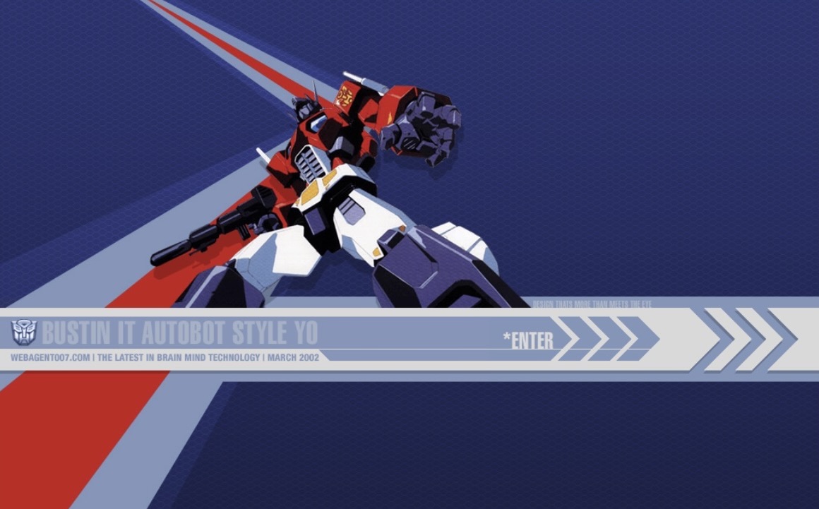
Exhibit A Webagent 007, March 2002. Via the Web Design Museum. A splash page that set tonal expectation, introduced brand texture, and signaled a mode shift before the user entered a single workflow.
We killed it and called it progress — and we had a philosophy to justify the killing.
Don't make me think
"Don't make me think" insults the user.
By designing for everybody we designed for nobody. The user became a passive consumer of narrowly defined workflows so static they had to be learned — not discovered. These interfaces don't reduce thinking. They redirect it. They force the user to adopt a specific and non-transferable cognitive pattern in service of the tool — and they do it while pretending to be helpful.
The damage created the opening.
Finding a chair to sit on and performing complex data analysis are the same operation at their core — a starting point and a desired end result. Every interface ever built was attempting this. Most failed by burying the desire under the mechanism.
The corrective
The chat interface is the manifestation of the most human workflow: desire → result. The learning runs in the right direction — the AI adapts to the user rather than requiring the user to learn a new system of thinking for a specific task. It can shift fluidly between task and instruction and back again without breaking forward momentum.
It helps users think. That is not a feature. That is a claim about what people are worth.
Maligned into extinction by the UX orthodoxy of the early 2010s. Unnecessary friction, skip the intro, get to the content. The critique wasn't wrong. What replaced it was.
Where the designer becomes essential again
The splash page knew something the orthodoxy forgot: that an interface is an address. It speaks to someone. It didn't ask you to learn a workflow before you entered — it asked you to notice something. That's not friction. That's an invitation, and invitations assume a person capable of accepting them.
The designer's job in this era isn't to remove all friction. It's to design the invitation — to decide what the user should notice before they begin, what context aids their thinking rather than replacing it, what tone signals that this tool was built for a person rather than a process. Chat reopened that question. The answer still requires a designer.
The interface that helps you think is not a convenience.
It's a position on what people are for.